
2012年5月3日星期四
2012年4月28日星期六

2012年3月21日星期三


2010年6月11日星期五
Project 3-Final Model of the Gallery

 Facade
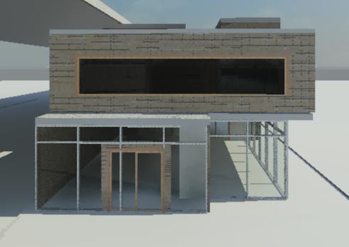
 The Apartment
 Gallery Area with no Ground Floor Ceiling
  The Stair Room
 Back of the Gallery
  Stair
Stair The First Floor Corridor
Project 3-Final Drawings of the Gallery
Ideas of the Gallery
Balance: The theme of the gallery is the abstrat art, so I made the overall form of the building quite simple, like the Venturi Mother's house(he applied the big scale in a small house to keep the balance), I use the simple shape to control the distorted arts.
Light effect: In order to have more wall spaces to hang the paintings and I also want to have some light changes in the gallery, I made a part of the gallery have no ground floor ceiling, and the walls and first floor ceiling above have a rib structure(which is made of glass and timber),so the light could pass through the walls and down to the ground floor gallery, therefore the light in the big display area is from dark to bright.
Circulaion: It is shown on the plan that the whole gallery is in the circulation, the stair lead the visitors to different spaces, from the small display area to the big display area then to the court yard and at last return to the original point.
Hazy Court Yard: I made the court yard a bit hazy, in my opinion things that are not clear is quite attractive, when the people walk pass the court yard and see the strange conture of
the sculptures, I believe the curiosity will lead them to walk into the gallery
 The Plan of the Gallery(Ground Floor:left, First Floor: Right)
 The Section Drawings
 Rendered Room-Plan and Sections
 Views in the Ground Floor
 Views in the First Floor
 Site Plan
2010年6月10日星期四
Project 3-Attempts
Attempt 1:
The idea of this design is inspired from the old style Chinese house,szu-ho-yuan, the main activity area is round as a square or rectangle, and in the middle is the court yard.
In this primary design, the galley area occupies the whole ground level and half of the first level,
and all of the other rooms and apartment are located in first level, and the court yard is in the middle of the ground floor, people in the first floor can see the view of the court yard from the above corridor.


Attempt 2:
This attempt nearly changed all of the aspects from last attempt, I want to focus on the balance between the theme and the form of the building; the circulation when walking around the gallery; and the light effect. I have played with its shape, and moved the court yard from the middle to the front, but there were still many problems, such as the large quantity of windows on ground level wall, and the funny gaps between the gallery and the adjencent buildings. And also the rooms in first level were too big.


 Attempt 3:
According to tutor's suggestion, I have minimized the amount of the ground level windows, reduced the first level room space and just simply divided the gallery space into 2 part, one is small the other is big.


 Attempt 4:
I removed the gap between the courtyard and the adjancent walls, moved the office and stock room from first level to ground level.


订阅:
博文 (Atom)
